Heuristic Evaluation of BNHM's Mapping Tool
The BNHM mapping tool is designed to provide a map of the georeferenced specimens retrieved through various other collections database seach applications. In its current incarnation, it uses language and assumes familiarity with GIS concepts and software that clearly indicate it is a tool intended for the researcher/expert user. In conducting this evaluation, the heuristic principles have been applied both to support better usability in general and also to widen the audience for the tool.
Contents
Severity 3: Major Usability Issues
- A) All tools should behave predictably and consistently.
- B) Mouse cursor modes should support appropriate actions.
- C) Address disorientation from non-semantic zooming.
Severity 2: Minor Usability Issues
- A) Reduce Modes.
- B) Provide feedback about the current state of the application.
- C) Provide features in order.
- D) Use the user's language.
- E) Provide graceful exits.
Severity 1: Cosmetic Issues
Introduction
First, the BNHM Online Mapping application should be commended for its simplicity of focus on the task of graphing and querying locations, and wide browser compatibility. Interviews with folks in the BNHM community and with educators reveal enthusiasm for having a mapping tool, and lots of ideas for how the tool can support educational objectives. A flexible, low-technology threshold online mapping tool is a valuable asset for the BNHM online presence. I hope these comments contribute to this rising excitement.
click to enlarge or reduce screenshot
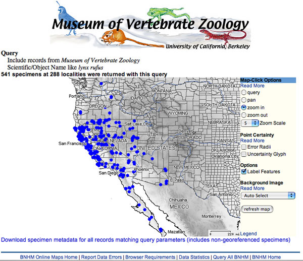
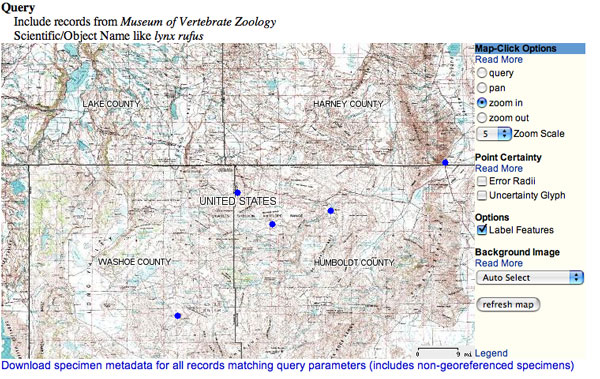
The interface for BNHM Online Mapping (evaluated June 2004)
This evaluation was conducted on the map obtained from the link: " • Scientific Name=Lynx Rufus Point Map (with MVZ banner)" on the introductory page, for the version of the interface public in June 2004.
click to enlarge or reduce screenshot
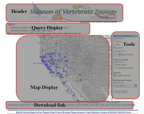
Regions of the interface referred to in the evaluation.
Severity 3: Major usability issues
A) All tools should behave predictably and consistently.
Currently, some actions take place upon clicking, while others require pressing the "refresh map" button. Two pull down menus behave differently - one changes a setting that can be seen on refresh (background image), while the other will cause no change on refresh (zoom scale). The zoom scale tool is not standard, and does not communicate its function readily to the user. H4: Consistency and standards
Suggestions:
- Activate "refresh" upon selection from the background image menu and changing any checked selection in the Options and Point Uncertainty sections. To keep the "refresh map" button for accessibility (eg. by screen-readers or browsers that don't activate the refresh upon clicking a checkbox), separate visually the cursor mode tools from the other tools, and then locate the "refresh map" button so that it 'reads' like it is associated with all of these other tools, not only the Background Image section.
- a) add a times sign to the zoom scale setting (eg: 5x)and group it with the zoom out mode selectors (when zooming in, users are encouraged to make a rectangle around the area of interest, so the zoom scale applies most to zooming out) or b) redesign the zoom tools to work more like those in Yahoo!Maps or Mapquest. Keep a click-on-map-to-zoom-in facility, but also provide a spectrum of related buttons that allow the user to move to other zoom scales readily. Signficant scales can be labelled. The currently displayed scale should be indicated, possibly by the deactivated state of the button that activated it.
click to enlarge or reduce screenshot
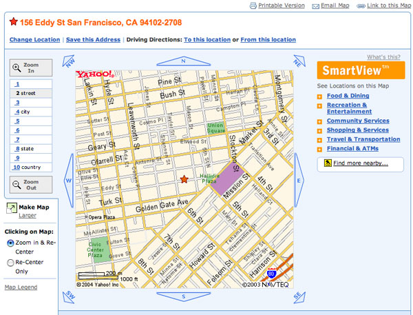
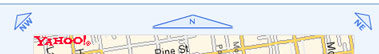
The interface for Yahoo!Maps, June 2004.
B) Mouse cursor modes should support appropriate actions.
Currently, all actions which can be activated by clicking on the map show a pointer cursor and allow a rectangle to be drawn. However, the ability to create a rectangle is cryptic - it is not obvious to the user that it is possible - and it is also inappropriate (has no effect) when zooming out and panning. H4: Consistency and standards
Suggestions:
- Change the cursor to a crosshair when the mouse goes over the map while "zoom in" or "query" are activated; this will communicate that a rectangle can be drawn with it. (example javascript file)
- Block the ability to draw a rectangle when "zoom out" and "pan" are activated.
C) Address disorientation from discrepancy between a person's understanding of a map and the mathematics of zooming.
As I click to zoom in on the lynx rufous map, I experience disorientation. After one click I see no names except "United States" and no longer know what state I am looking at. After one more click, I see only county names from this unknown state. While the zoom is mathematical, my conception of maps is semantic and hierarchical; levels have meaning and familiarity to me in a way that doesn't necessarily match with the scales at which the zoom helps me view it. H2: Match between system and the real world
click to enlarge or reduce screenshot
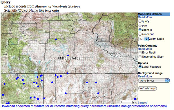
The BNHM Online Mapping interface after one click, while the "Map-Click Options" are set to the default "zoom-in". This is a likely first action for many users. My click was on one of the blue dots, although I don't know which one. I am also missing feedback about which state I am looking at.
click to enlarge or reduce screenshot
The BNHM Online Mapping after two zoom-in clicks. Here I have labels for counties, although the state they belong to remains mysterious!
Suggestions:
- Improve the behavior of the labels so that I always see information about the larger political unit I am zooming in on.
- Note the use of semantic categories like "street" "city" "state" and "country" on Yahoo!Maps.
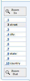
The "zoom specturm" from Yahoo!Maps. The spectrum supports both gradual and dramatic zooming with one click, while providing feedback about the current zoom level on the same display. Zoom levels corresponding to scales with meaning for human users are labeled, eg."street" "state" and "country." This mild implementation of "semantic zooming" helps the user navigate effectively among the scale changes. - Consider features like ESRI's zoom-to-full-world button. More logically in this application, it would zoom out to the original/initial view. A good location for it is on the zoom spectrum or near the query display.
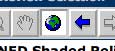
Many GIS software products from industry-standard ESRI use a world icon button , which, when pressed, zooms the view out to the full extent. It's not clear to me that the globe is an intuitive icon for this functionality. It is also important, in the BNHM Online Mapping, to think about other scales that a user might wish to return to than the global one; for example, the initial view. However, the one-click leap which returns to the start is a good functionality. - Consider the 'keymap' or overview map feature used by Yangtze.
click to enlarge or reduce screenshot
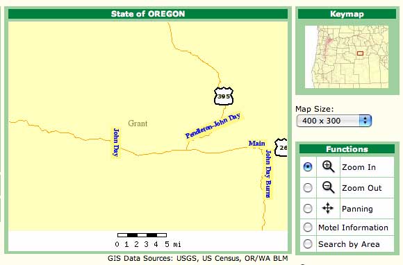
The Yangtze mapping environment provides a overview or "keymap" indicating where the main display map can be found in a larger context. A red rectangle on the keymap outlines the location of the current view of the main map. This keymap could be improved further by, for example, using heavier lines for the familiar state boundaries.
Severity 2: Minor Usability Issues
A) Reduce Modes.
Modes such as those under the "Map-Click Options" section are may be confusing; they require the user to recognize that they wish the same action (clicking) to have a different effect, and then to find and change the setting. This often draws more attention to the tool than the task the user is trying to acheive. Consider replacement of modes with buttons that provide the same functionality with one click and leave the user's focus on the information object being manipulated. In mapping applications, clicking on something to zoom OUT is not intuitive, and the interaction of clicking on a spot to re-center an image is also somewhat strange. H4: Consistency and standards; H1: Visibility of system status; H2: Match between system and the real world
Suggestions:
- Replace the "pan" mode with buttons around the outside of the map display that accomplish the same thing. See Yahoo!Maps for an nice example. Alternatively, ESRI's data download interface shows an example of a pan mode with a high degree of control over how rapidly the underlying map is moved (the user grabs and displaces the image the desired amount within the display frame), good instant feedback about the effects of the user's actions, and the use of the hand cursor to indicate the mode.
- Make "Zoom out" a button that simply performs this action when clicked.
The panning tools located around the map display from Yahoo!Maps. This style of one-click panning avoids the need to change into and out of "panning" mode, and reduces the need to calculate "re-centering" in one's head. This is a very public-friendly implementation of panning.
click to enlarge or reduce screenshot
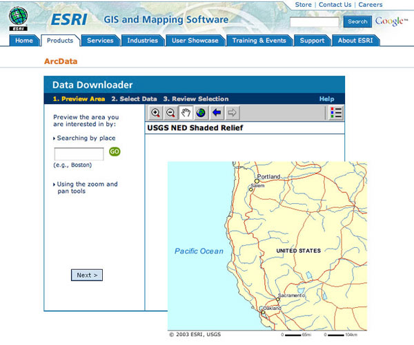
ESRI's ArcData interface for locating which GIS data layers you'd like to download supports a nifty panning operation. Using the cursor in panning mode, the picture is dragged until it is oriented in the map display frame as you'd like to see it. On release, the screen re-fresh updates the white areas with the new map content.
B) Provide feedback about the current state of the application.
Which zoom level am I at? Which dots are selected? As I zoom in, what part of the map am I looking at? Which points do I now see in the window? Are those points that I selected or clicked on? H2: Match between system and the real world H6: Recognition rather than recall
Suggestions:
- If a zoom spectrum is used, provide an indicator for the current zoom level.
- Continue to show "Found 541 specimens at 288 localities" at all zoom levels.
- If a subset of the points are selected, provide a statement about that, too. Put the links to "view" and "download" that selected record set right next to this statement. The "view" can use an anchor to hop down the page to the table display below.
- Provide feedback that a set of points have been selected by giving them a different color or shape. As I zoom in, I will know if I am looking at selected or not-selected points. Use conventions people are familiar with - Yahoo's red star, or ESRI's yellow highlighting.
- Consider a text display or other indicator of how many of the points on the map are visible within my current view.
C) Provide features in the order they are needed.
People tend to scan a webpage as they identify what they can do with it rather than read instructions. Shared context and grouping can help people "read" what features mean, reducing the need for text. For example, the query display, the legend, and the download link are all in different locations. This requires extra description of the download link, and if the legend's color code is important to understanding the map, it should be visible rather than requiring a click. The query display describes the result set, and is a good place to locate the link to download the result set's records, and to introduce the meaning of the colors of the dots on the map. H2: Match between system and the real world H8: Aesthetic and minimalist design
Suggestions:
- Move the "Download all found records" link to be with the query display.
- Move the colored dots from the legend directly into the query/"search" display. As the institution's name is listed, show the dot. If there's only one institution & the header is right there, you may not need the line "Include records from the MVZ" at all - in fact, it is confusing if people already think that's what they are doing because of the context by which they come to the map.
- If a subset of the points are selected, provide a statement about that, too. Put the links to "view" and "download" that selected record set right next to this statement. The "view" can use an anchor to hop down the page to the table display below.
D) Use the user's language.
Edit to reduce and clarify text. For example, the term "Query" is not in common usage, and yet is used both for the original result set (which places dots on the map) and the subsequent result sets (which are defined by interacting with the map). H2: Match between system and the real world H4: Consistency and standards H8: Aesthetic and minimalist design
Suggestions:
- Replace "Query" with "Search for:" in the display of the original query, and any other references to this usage.
- Replace "Query" with "Select" under "Map-Click options" and use the concept of "selection" in any other references to the result sets specified subsequent to the original opening of the map.
- Replace "pan" with "Re-center map" as this is a better match to what happens upon clicking.
- Shorten "Download specimen metadata for all records matching query parameters (includes non-georeferenced specimens)" to: "Download all found records". Include the extra information only if it is relevant; that is, only if there are non-georeferenced specimens: "Download all found records (includes ### non-georeferenced specimens)"
- Shorten "541 specimens at 288 localities were returned with this query" to: "Found 541 specimens at 288 localities" or "Showing 541 specimens at 288 localities".
- Shorten "(Download just specimens within query box)" to "(Download)"
- Shorten "1 specimen has been found in this query box. View result at bottom of page" to "1 specimen is selected"
- Shorten "Geographic Query Results" to "Selected specimens:"
- In the "Read more" windows, supplement the technical information for advanced users with information for new users by including a brief statement about what the purpose of the tool is! For example, explain point uncertainty, and perhaps explain something about which display is better for which purposes. I would be happy to work on editing those with you.
click to enlarge or reduce screenshot
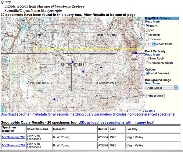
Query mode in the BNHM Online Mapping application. The yellow box indicates the rectangle drawn in the previous interaction, which triggered the selection of the records now displayed below. One challenge is ensuring that users notice the display below the map (especially on smaller monitors & older browsers, where it may easily fall below the page view), and connect it with the selected subset of dots.
E) Provide graceful exits.
Users will be passed to this application from some other website, where they will have likely only just figured out the navigation, etc. They may even not realize what the link they clicked actually did. Users should either continue to see that navigation, or see a simple way to get back to original place that forwarded them.
Notice that a customized header, such as the logo for the Museum of Vertebrate Zoology in the example interface, sends a different message about where the user is than do the BNHM navigation links on the bottom of the page, and the title of the page if they make a bookmark. Consider providing some additional customization for the footer links and the page title to help the user understand that BNHM Maps is a customizable service which has been called up by the instution where they started their web search. H3: User control and freedom
Severity 1: Cosmetic Issues
A) All tool headings - Map-Click options, Point Uncertainty, Background Image - should have, or not have, the blue background banner. H4: Consistency and standards
B) Suggest moving the "Read more" to the right-hand side of the features they apply to. Perhaps use smaller font size.