Static Tree Visualizations from 'Assembling the Tree of Life'
Documenting the current state of knowledge at the beginning of NSF's Tree of Life initiative, the book Assembling the Tree of Life (Eds. Cracraft and Donoghue, Oxford University Press, 2004) presents various static versions of the tree and parts of the tree. As a result of the chapters being prepared by a variety of authors, the diagrams demonstrate a variety of features. Here, selected diagrams demonstrate some desirable and not-so-desirable features of static tree-of-life diagrams, particularly for communicating with the public or high school audiences.
The diagram below focuses on the major branches of the tree of life. Different colors are used to indicate features of the branches; in this case, the darker the branch, the more likely it is to be right.The rounded branching display is positive, as it avoids giving any obvious progression to the tree and any implications of "progress." The fonts are friendly, but this isn't a teachable tree. For public or high school audiences, there are possibly two recognizable words: "Bacteria" and "plants". Even I don't know where humans would be on this tree.
click to enlarge or reduce screenshot
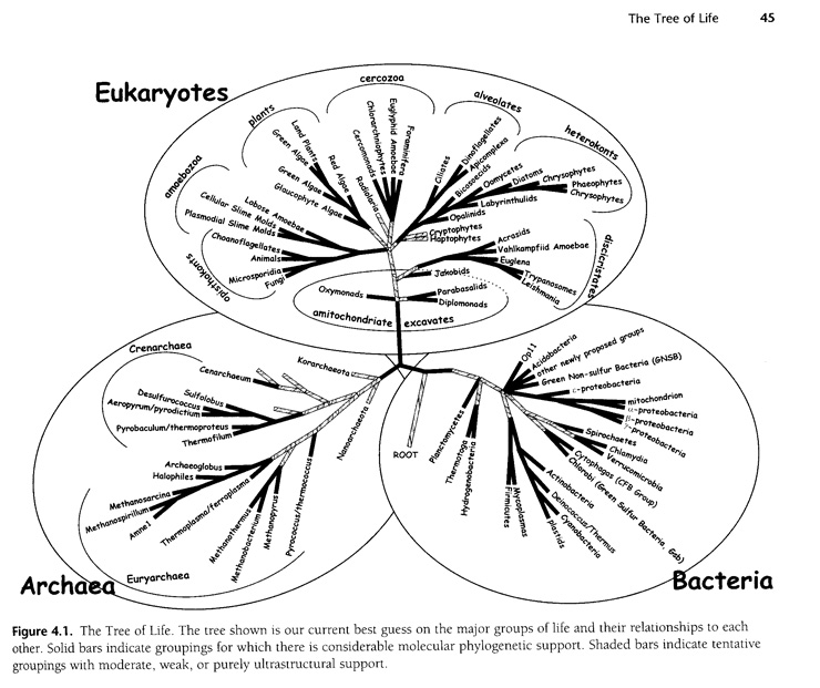
Figure 4.1, from The Tree of Life: An Overview. S. L. Baldauf, D. Bhattacharya, J. Cockrill, P. Hugenholtz, J. Pawlowski, A. G. B. Simpson. Chapter 4 in Assembling the Tree of Life (Eds. Cracraft and Donoghue, Oxford University Press, 2004)
The figure below attempts to compile the work within the various chapters of the book into one Tree of Life. Again, this isn't a teachable tree. This diagram is already a summary, although it would probably be overwhelming for public or high school audiences. There are possibly four recognizable words among the big labels: "green plants" "Animalia" "Bacteria" and "Fungi." An admirable number of the small-text leaf nodes are common names. Notable features of this tree visualization: The length of the lines is solely functional, being as long as they need to be to draw the tree structure with all leaf nodes lined up. Two different ways to label important nodes or clades are shown here: labeled circles and labeled vertical lines.
click to enlarge or reduce screenshot
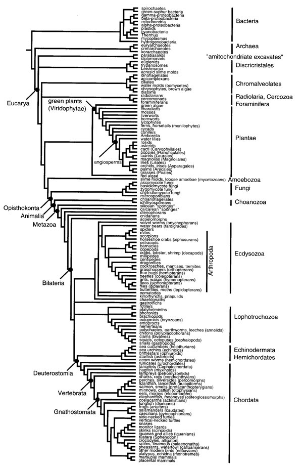
(open big version in new window)
Figure 34.1, from Assembling the Tree of Life: Where we stand at the Beginning of the 21st Century. Joel Cracraft and Michael J. Donoghue. Chapter 34 in Assembling the Tree of Life (Eds. Cracraft and Donoghue, Oxford University Press, 2004)
This diagram summarizes the tree above. It is simpler, and has a few more common names for the major groups. Again, the length of the lines doesn't have meaning. People who know that humans are mammals will probably be able to find themselves on this visualization of the tree, and they might be struck by seeing birds "farther along" on it. This quantity of named groups is probably a good level of detail for a teachable tree, but should be presented in a more graphically sophisticated and memorable manner, potentially to emphasize an interesting take-home message.
click to enlarge or reduce screenshot
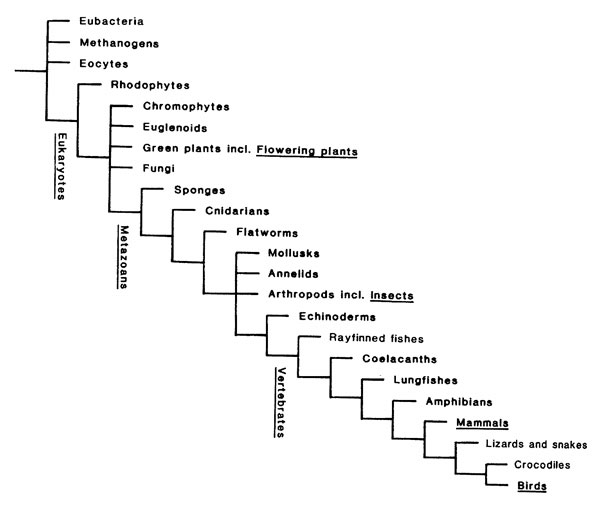
Figure 34.2, from Assembling the Tree of Life: Where we stand at the Beginning of the 21st Century. Joel Cracraft and Michael J. Donoghue. Chapter 34 in Assembling the Tree of Life (Eds. Cracraft and Donoghue, Oxford University Press, 2004).
These next several diagrams don't attempt to show the entire Tree of Life; only a part of it. There are an amazing number of diagrams throughout the book, covering various parts of the tree. These have been selected to demonstrate a variety of interesting features of static tree diagrams.
An ambitious diagram below shows the relationship among the chordates. The vertical position of the beginnings of the lines indicates the geological time when each group began. The different position of the endings of the lines is potentially confusing. The scientific name labels are obscure. However, the pictures help significantly to communicate the meaning of the groups across the top. Although it definitely risks conveying a sense of humans as the latest result of "progress," people should have no trouble finding themselves on this diagram. Use of common names could help people take home other messages from it.
click to enlarge or reduce screenshot
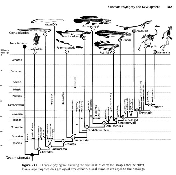
(open big version in new window)
Figure 23.1 from Chordate Phylogeny and Development, Timothy Rowe. Chapter 23 in Assembling the Tree of Life (Eds. Cracraft and Donoghue, Oxford University Press, 2004).
The diagram below shows structure within the branch of mammals. Again the vertical lines indicate geological age, and extinct groups are shown in a clear fashion by the little dagger symbol (although it still requires a legend). Three pictograms indicate the important categories, and emphasize the major take-home message. Different font sizes reinforce the nesting structure of the named clades. This approach avoids an artificial distinction (often shown in the other diagrams) between the names that are inclusive of other names, and those that are leaf nodes in this diagram but on another diagram would be inclusive of many more names. The annotations are a nice touch to emphasize how the nesting works. My guess is it would still require a pretty good understanding of mammals to figure out where a human fits on this tree.
click to enlarge or reduce screenshot
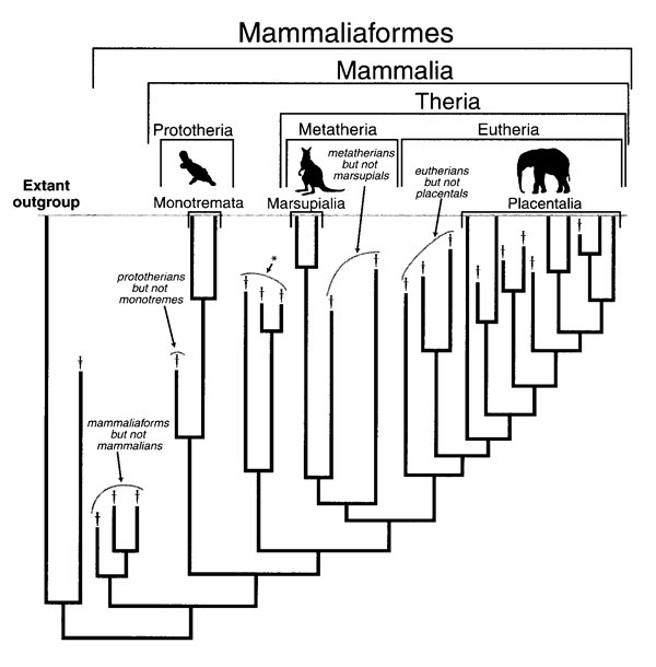
(open big version in new window)
Figure 28.2 from Building the Mammalian Sector of the Tree of Life: Combining Different Data and a Discussion of Divergence Times for Placental Mammals. Maureen A. O'Leary, Marc Allard, Michael J. Novacek, Jin Meng, John Gatesy. Chapter 28 in Assembling the Tree of Life (Eds. Cracraft and Donoghue, Oxford University Press, 2004).
This diagram for a part of the green plant branch demonstrates additional approaches to labeling clades/major groups, including the shaded triangles that give a sense of the relative size of the group by some unspecified measure (evocative of the clade-collapsing tool in Mesquite). Synapomorphies, or major characteristics that define an entire branch, are also presented nicely. Specifically, this diagram is struggling with placing existing group names, such as "Gymnosperms," onto a branching diagram when the name cannot be applied to an entire branch, but only a part of it; here, Angiosperms are on the same branch as many things considered Gymnosperms, but Angiosperms aren't Gymnosperms, so Gymnosperms is no longer a good name for any entire branch. Similar problems will arise for many biological category names that audiences for the Tree of Life may be familiar with.
click to enlarge or reduce screenshot
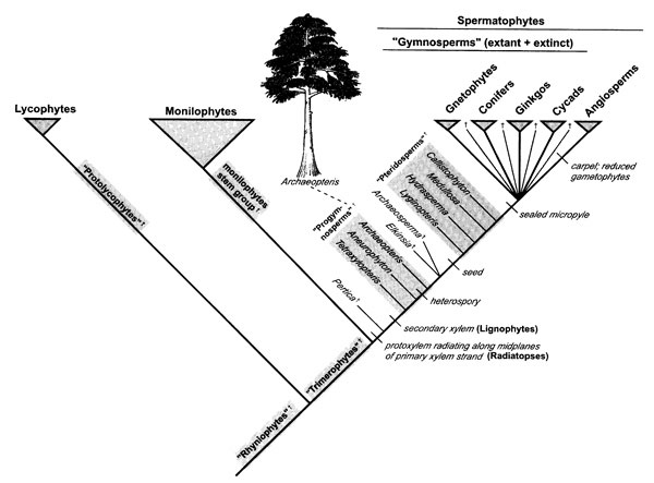
(open big version in new window)
Figure 10.6 from The Radiation of Vascular Plants. Kathleen M. Pryer, Harald Schneider, Susana Magallón. Chapter 10 in Assembling the Tree of Life (Eds. Cracraft and Donoghue, Oxford University Press, 2004).
A diagram showing the secondary branches of the Eukaryotes. The width of the wedges indicates the relative sizes of the branches, making the diagram much more interesting.
click to enlarge or reduce screenshot
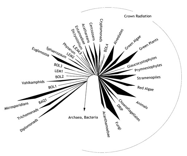
(open big version in new window)
Figure 5.5 from The Early Branches in the Tree of Life. Norman R. Pace. Chapter 5 in Assembling the Tree of Life (Eds. Cracraft and Donoghue, Oxford University Press, 2004).